POSTER | TYPOGRAPHY | GRID | PAGE LAYOUT
Exhibition Design
TOOLS: ADOBE ILLUSTRATOR
Project Overview:
For this assignment you are given a group of information for an event that you are to create promotional material for. This information should be designed using grid, type study, and more to create a strong and professional design for audiences to easily read.
Project Objectives:
• To experiment with grid and typography
• To gain an understanding of layout
Type and Grid Study
Studying different grid designs to experiment with layouts with different typography variations.


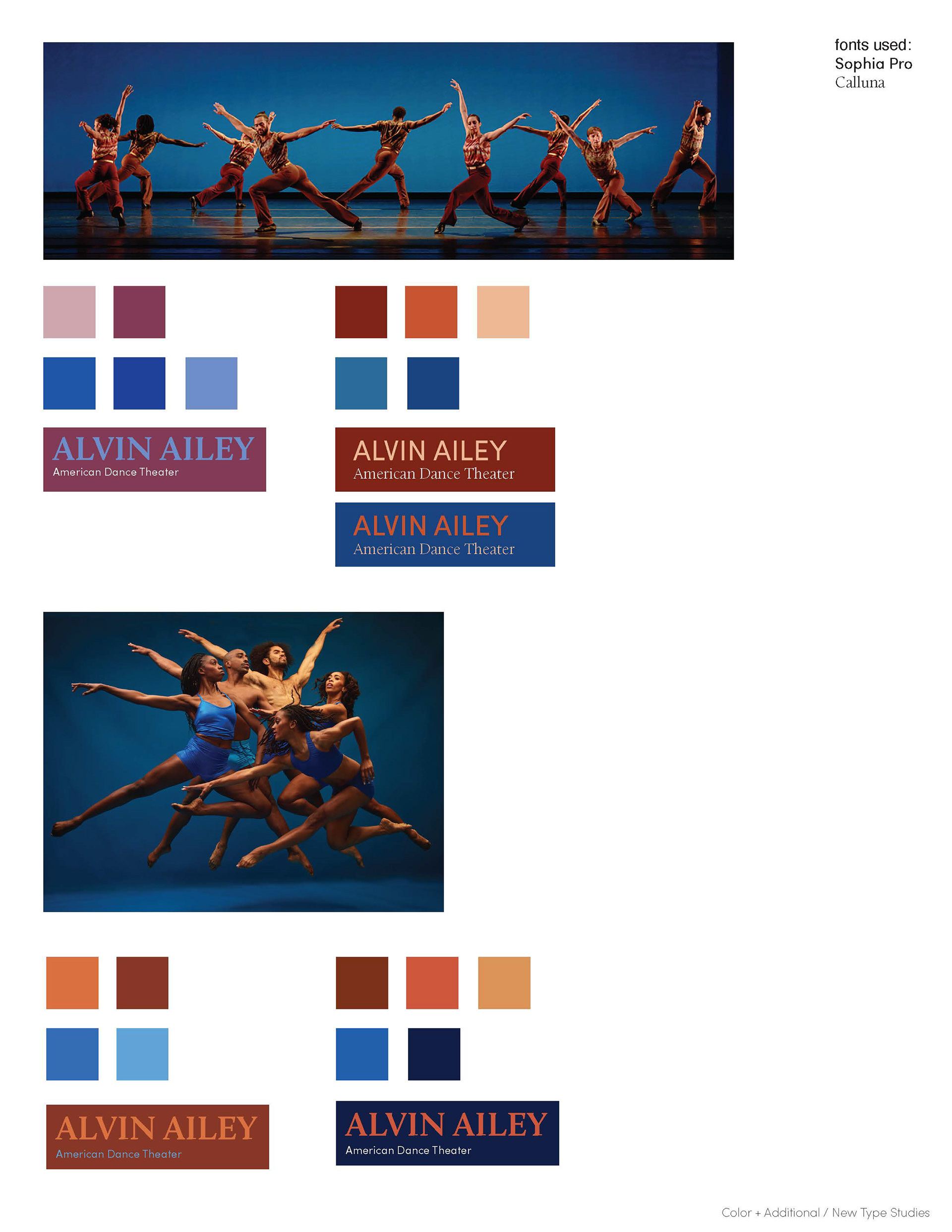
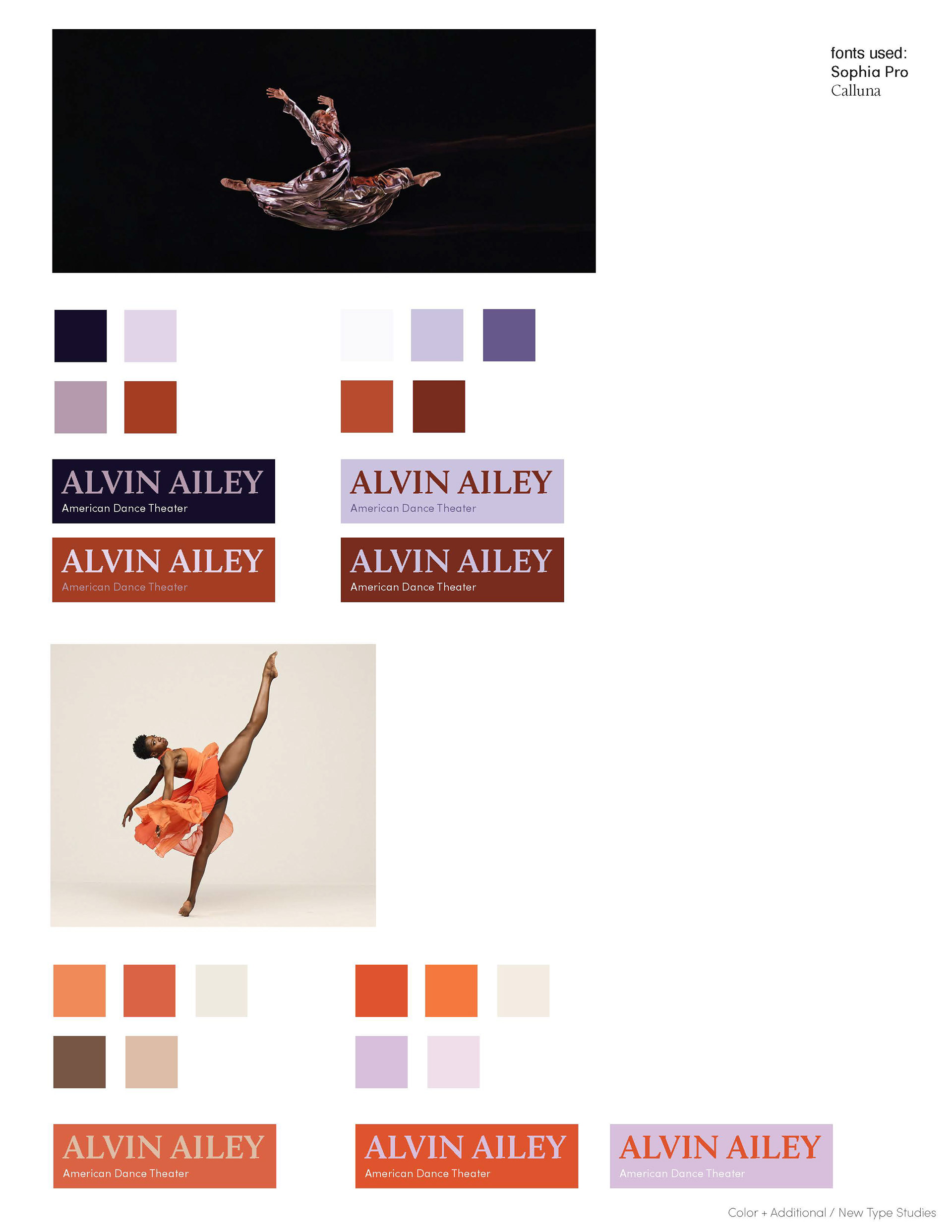
Color and Type
Studied different typography and color studies, experimenting with color pairing with the images as well.


Ticket Variations
Made different compositions for the ticket design working with different images and colors.


Poster Variations
Started off by making different designs with different compositions experimenting with different photographs and grids.


Exhibition Ticket
The final ticket design including specific information using the same color and images creating a consistent collection for both poster and ticket.
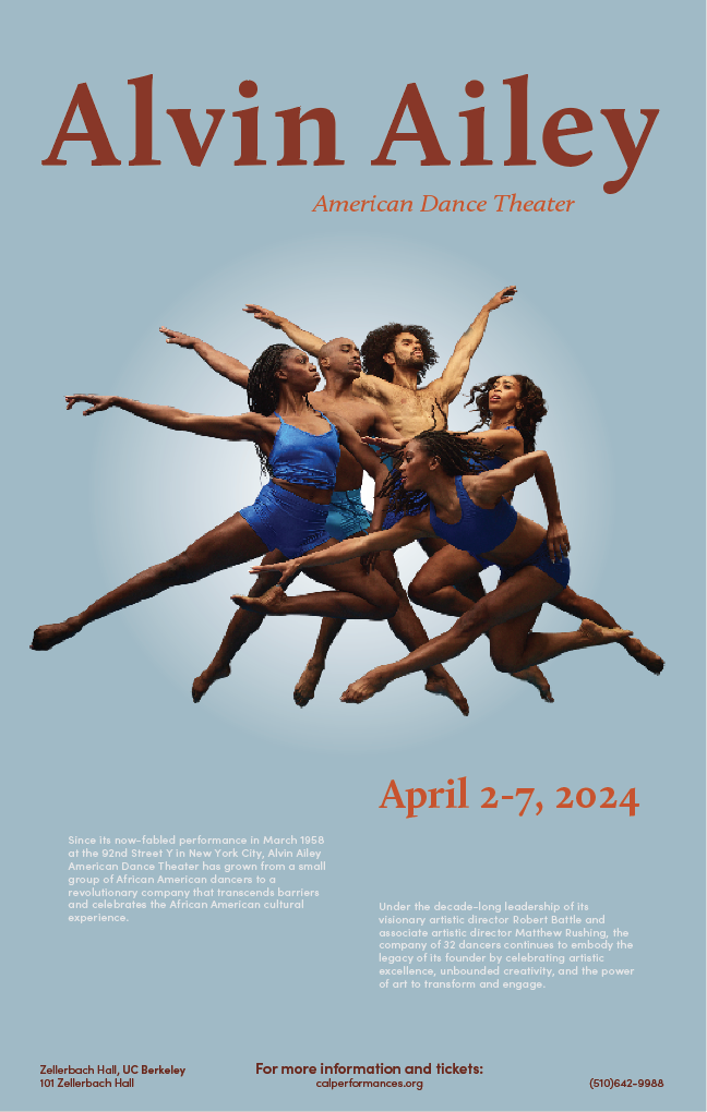
Exhibition Poster
The final poster for the promotional event using a cohesive color palette and using grid for the layout.
